
Article and research by DesiCreative reader Anas KA. Reprinted with permission from his site Kikkidu.
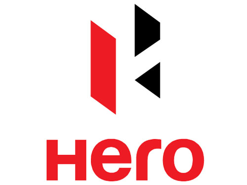
Brand: Hero Motocorp
Owned by: Hero MotoCorp Ltd. (Formerly Hero Honda Motors Ltd.)
Logo Designer: Wolff Olins
Design brief:
“The new logo stands for the new face of India – that youthful energy and ‘can do’ spirit. It is in true sense the “Indian Catapult” which signals that while it is deeply rooted in Indian values, it is also poised to go for global expansion – a Leap of Faith.
The new ‘Catapult’ logo
Before discussing the logo, let us talk about the new TVC. The updated slogan that comes with the new logo is “Hum mein hai Hero” (A Hero lives in us). The new ‘Hero Anthem’ TVC features our ‘Mozart of Madras’ A R Rahman.
The logo revolves around high energy and space. The colour red in the logo depicts continuity and change. It also depicts confidence. There is an ‘H’ formed in the logo. The angular formation of ‘H’ symbolises that Hero is no longer dependent on foreign expertise for its brands. It will be focussing on its own engineering capablities.”
[desi]URQ8Tfk6iqU[/desi]
Law & Kenneth created this TVC for Hero Motocorp. The new Hero website is created by Digital Law & Kenneth. Hero is leaving no stones unturned to convey that Hero Honda is now Hero Motocorp.
Regarding the new Hero logo, I must say that at least for now, I am not a fan of it. I don’t know, it may take some time for the logo to sink into me. The ‘H’ that is formed as part of ‘Closure’ technique is easy to spot. Although I have seen the word ‘catapult’ many times in the news related to this logo re-branding, I am failing to see its relevance in the logo.
One more thing that troubles me is the black triangle/arrow that is facing backwards (towards the left hand side). The other, bigger black arrow that looks forward is blunt; it has lost its sharp point. I’m waiting for the design brief from Wolff Olins when all the mysteries will be revealed.
I have reasons to believe that the font used by Hero logotype is a variation of Harabara font. In the above image, the green colored ‘Hero’ is in Harabara font. I have overlaid it on top of the present ‘Hero’ logotype for comparison. See this image for a closer look.

Tech Tip : Now you can remotely load/access your windows based essential Logo design software such as CorelDRAW etc. on trending citrix xendesktop from CloudDesktopOnline at an unbelievable xendesktop cost in the market. If you prefer a gpu dedicated server, try dedicated gpu hosting from one of the leading cloud hosting providers – Apps4Rent.

-
-
-
-
-
-
-
-
-
-
-
-
-
-
-
-
-
Show Comments“The angular formation of ‘H’ symbolises that Hero is no longer dependent on foreign expertise for its brands” — it is dependent on a foreign designer, you could not find an indian hero for you creative?
Unable to find connect between brief and the logo, I so agree with Santosh.
I like new logo.
Where is the Hero? … climbed up the ladder!
good logo, good
tips to build a super hero bike..handle low..light also low..big rear tyre..cylencer long with some big noise…ful body cover with differance colour…red and white,yellow and black,black and grey..etc twin head lamp..split seat….rear and front disc brake….
Bad logo. Like the writes says, we will have to wait for the design brief from the designers. The mark (H) does not compliment the font used.
Just the ‘R’ in the logotype could have been in deep grey, symbolic of the new HERO moving ahead and taking a turn to the right. This new logo is all ‘bull’
change is required from time to tme…..
hero akdam bhangar company he new bike ka bhi koi thikana hi nahi he
It’s a nice logo, but is the new Hero gonna sell furniture ? Cause the logo looks like this. I guess – it’s just a clients fault, but… still – the mark could be different. Waiting for the next rebranding.
PS: I can’t load the second picture – there’s a big white space in the post … I assume it’s a picture.
the colour of H should be different thats blue
THIS LOGO IS VERY FANTASTIC. SO I LIKE THIS.I THINK THIS VEHICLE IS VITAL PARTS OR OUR INDIA PEOPLES LIFE.
the new hero logo is simple and nice
i am very happy because you mention the font name also
India ka dhadkhan
.
Red stands for beauty and black stands for power & capability..so after separating from Honda ..hero is now beautiful and powerful…